Media queries

,
Tags: CSS
Once I'd finished my beginner's course in web design (Ian Lloyd's Build Your Own Website The Right Way Using HTML & CSS), it wasn't too long before I came across responsive web design and media queries. It looked easy to my naïve, youngish eyes, and to be honest, even though I've read Ethan Marcotte's Responsive Web Design, it still looks easy. A cursory look at the CSS behind TGD tells me the gods of responsive web design are tittering into their curly brackets right now.
In the next few posts, I want to look at The Great Discontent and find out how it handles responsive design, starting with a look at the media queries that the site uses.
Skip to navigation(max-width: blah) and (min-width: blah blah)
The most common use for media queries is for changing the styling rules in CSS according to the width of the browser window. Width is not the only criterion possible, but it is the most common, and TGD uses media queries a lot. In a future post, I want to explore the way TGD uses media queries, but here I just want to look at the rules for media queries and the effects they have.
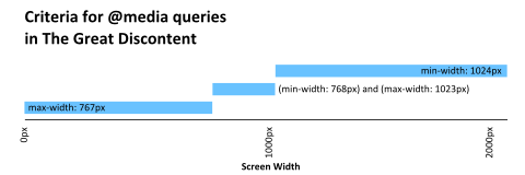
So, the three most common rules in TGD's media queries are max-width, min-width, and a combination of the two. Basically, imagine that you are using a desktop device and your browser window is at its most narrow. As you pull out the right-hand edge of the window, the media queries will kick in one-by-one. Let's say the first media query has the criterion, max-width: 767px.
@media (max-width: 767px) { ... }While your browser window is less than 768px, the rules in this media query will apply. When the width goes over 767px, the browser ignores these rules.
The next criterion is (min-width: 768px) and (max-width: 1023px):
@media (min-width: 768px) and (max-width: 1023px) { ... }These rules kick in when the browser window is between 768px and 1023px. Again, the rules in this media query are ignored when the width of the browser goes lower or higher than this range.
The third media query applies when the browser hits 1024px or more:
@media (min-width: 1024px) { ... }From 1024px or above, these rules are applied to your HTML, but less than this and they are ignored.
The figure below illustrates the browser widths at which the above media queries kick in or zone out.
There are a few good articles on the criteria which you can use in media queries here: cssmediaqueries.com, here: pieroxy.net, and in chapter four of Ethan Marcotte's Responsive Web Design.
Skip to navigationFlexible design and media queries
In addition to the above, Marcotte recommends that:
[M]edia queries alone do not a responsive design make. A truly responsive design begins with a flexible layout, with media queries layered upon that non-fixed foundation. [… S]tarting from a flexble foundation means we have less code to produce.
This means that, if we design a website to be fluid and flexible, we shouldn't need that many media queries at all, just some rules that stop the design from getting too cramped or agoraphobic. It᾿s interesting when I look at the CSS in the Great Discontent, which I estimate has around 120 separate @media calls, and 40 different criteria in its media queries! To me, that seems like a lot, but maybe it᾿s just my inexperience.
Right, well, that's enough babbling on for one evening. My next research question is: What breakpoints does TGD use, and do they mean anything?
Skip to navigation
Comments
comments powered by Disqus