A content creator's guide to writing for Wordpress

,
Wordpress.com offers a free domain and a fairly easy-to-use CMS interface to anyone around the world who wants to create a website. For non-web developers, this kind of tool can be a lifesaver. Anyone can have a blog without ever having to worry about the code behind the scenes. And one of the key tools that Wordpress offers to enable this is its visual editor, which provides a word processor-like (WYSIWYG) interface so that users can add text and images easily.
WYSIWYG woes
However, all is not as it appears. As Karen McGrane points out in her 2013 article, WYSIWTF, there's a big difference between a word-processor document and a web page. Word processors were created with one-size-fits-all laser printers in mind, but web pages need to fit into all manner of screen shapes and sizes. While a blogger might be writing a post on a laptop with a 1366 × 768px screen, the readers of that post might be using any of thousands of possible devices, from smartwatches and mobiles to the gigantic monitors used by design professionals. Web browsers (Internet Explorer, Google Chrome, etc) also have small differences in the way they display the same page. The way a user interacts with a page also varies, and includes mouse, touch screen, and keyboard among others (try navigating a site using just the TAB key on your keyboard to see what I mean). Even the way colours appear varies between devices, as the same device ages and in different ambient lighting conditions.
That's not all. Some users with visual or other impairments might not even be seeing our content, but using a screen reader to convert written content to spoken word. And you could argue that the crawlers used by search engines to index and rank web pages are technically site users. While they are becoming increasingly sophisticated in the criteria used to rank sites, the quality of the underlying code is still one of the main things they check.
What all this means is that, although the Wordpress visual editor provides simple-to-understand buttons to help us style our content, in truth, the control we have regarding how our content appears to users is actually very limited. Furthermore, we have a responsibility to make sure that the content we produce can be accessed by our audience, and that the way we add content doesn't penalise them because they're using a device which we didn't account for. Movements in the web development industry such as responsive web design and mobile first have solved many of the problems that stem from the endless range of contexts in which users access our content. Although there are Wordpress plug-ins out there which promise to make sites more responsive or more mobile-friendly, wordpress.com hides these behind a paywall. So, it falls on the shoulders of content creators, not web developers, to make sure that their content reaches the widest audience.
So, what can content creators do to make sure their Wordpress.com sites are truly responsive? In this post, I want to list some practical do's and don'ts. Some are more on the technical side, some are editorial, but most lie somewhere in the middle.
General guidelines
First of all, there a few basic principles and workflows that can improve the quality of the content we produce for Wordpress.com sites.
Create content for the lowest common denominator
When you're writing a blog post, keep in mind the worst possible conditions under which someone might end up reading it. Even the title of this recent article by Andrés Galante gives some idea of what these conditions could be: Mobile, Small, Portrait, Slow, Interlace, Monochrome, Coarse, Non-Hover, First. Just to elaborate a little, though, here are some of the pitfalls to avoid:
- Mobile: This word implies two things — a small amount of space on the screen and, potentially, a poor or intermittent internet connection.
- Small: Even within the 'mobile' category, sizes vary a lot, and when we go down to smartwatch, things get even smaller. Think about what your content might look like to someone on one of these very small devices.
- Portrait: While many mobile devices allow the user to turn it to landscape orientation, not all do, and not all users with that option will remember to use it.
- Slow: If someone is reading your post using their 3G mobile data connection, they probably don't want to be downloading huge images taken on a snazzy digital camera.
- Interlace: Some devices aren't able to render images (or even text) in the same fine detail as your fancy iPhone, so bear this in mind when you're selecting and refering to content.
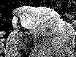
Figure 2: Although this image is from a ZX Spectrum, it gives an example of what an image with interlacing looks like. - Monochrome: Some devices with monochrome displays, such as the Kindle, are internet-capable. Admittedly, there probably won't be that many users reading your post on such a device, but you never know. So, don't rely too heavily on colour to get your meaning across.
- Coarse: In terms of pixel density, devices range from high-definition retina displays to screens with chunky pixels visible to the naked eye. For the latter case, don't rely on images that require the user to discern fine details (Update: After checking this post on my mobile, I noticed I break my own rule here in Figure 6, below. Who said writing for the web was easy?).
- Non-hover: When the web first came into being, many features were hidden behind mouse hover actions. As soon as smartphones came along, though, we realised that you can't assume that users will have a mouse. There's not a lot that a blog writer needs to worry about here, but, it may affect the instructions you give to users ("If you hover over this, you'll see…")
Test your content on different devices
It's part of a web developer's job to check as much of their work as possible on different devices and in different browsers. As I've argued, a blog writer on a Wordpress.com site must take on some of the tasks that a web developer does. It doesn't hurt, therefore, to check how your blog holds up on a mobile or tablet from time to time. This is particularly important if, for example, you always write your posts on the same PC or laptop.
You could even try it in a few different browsers. If you normally use Internet Explorer, try it in Chrome, Firefox or the default Android browser to see if there is anything that diminishes the experience for your readers.
Learn (a little) HTML
I know, it's probably the pie-in-the-sky thinking of an incorrigible pedant, but I think learning a little bit of HTML can save you a lot of bother in the long run. The most common tag types are headings, paragraphs, ordered and unordered lists, links and images. If you're familiar with these, you're covered for the vast majority of content types that you'll ever need.
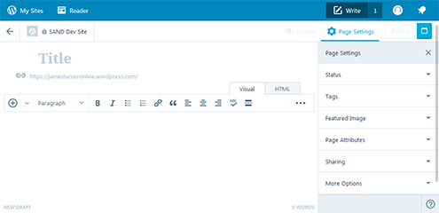
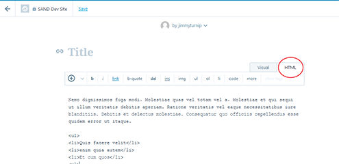
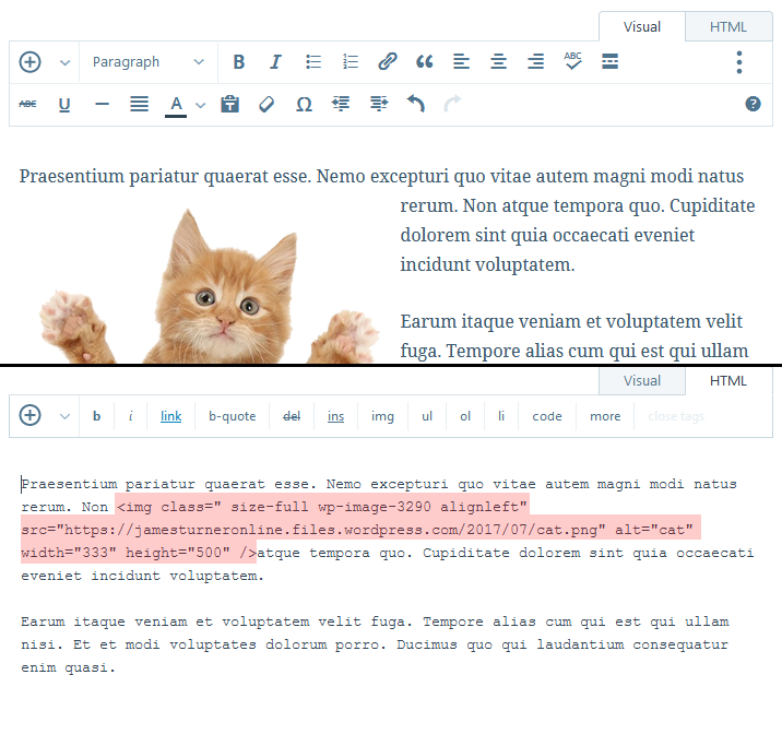
How is HTML useful? Well, when you're writing your blog post, you should see two tabs: visual and text (or HTML). It's the text tab that allows you to see what code the visual editor is pumping out. There will be times when the content in the visual editor isn't behaving itself. The chances are that the underlying HTML has got messed up somewhere along the way, and you can check this by looking at the 'Text' tab. At other times, the content in the visual editor looks fine, but the underlying code is a mess. An example is when you've mistakenly added a floated image in the middle of a paragraph. So, get into the habit of checking your writing in the text editor.
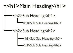
Headings
Headings tell us something about the hierarchy of a text, including how important each bit of content is in relation to those around it. For example, the text under a first-level heading more than likely gives a broad introduction to the content. On the other hand, two third-level headings next to each other suggest that the content underneath each is related at the sibling level. For sighted readers, headings provide a visual clue. For people using a screen reader, they make navigation easier, as most screen readers have 'skip to next heading' and similar commands. And for search engines, they indicate how your document is structured.
Some points to bear in mind about headings:
- In the body of your post, start your headings from
<h2>, not<h1>. Generally, there should only be one<h1>heading on a webpage, and since most Wordpress themes automatically add this as the post or page title at the top, you should never need to use a<h1>heading in the body of a post. - Avoid skipping heading levels in your document hierarchy. For example, it's considered impolite to jump from
<h2>to<h4>, and so on. - HTML allows you to go as deep as
<h6>, and to quote Robert Bringhurst in The Elements of Typographic Style:Use as many levels of headings as you need: no more and no fewer
Personally, however, I find I rarely need to go deeper than<h3>in a typical blog post. - Choose headings according to the structure of your text, not according to how they look.
Paragraphs
Wordpress adds <p> tags to your text automatically whenever you break to another line, so you don't normally need to worry about them. However, it's worth bearing in mind that Wordpress does insert them and you don't have to.
Ordered and Unordered Lists
Lists are indicated with <ol> (for ordered, or numbered, lists) or <ul> (for unordered, or bulleted, lists) and a series of list items, <li>. They have a particular meaning in HTML. For example, screen readers will inform users how many items there are in the list, and allow them to navigate the list more easily. If you have a list of twenty names, it's not fair to expect screen-reader users to listen to the whole lot. Put it in a list and give them the choice. Here's an example of how not to do it:
England Team Squad for India 2017:
Liam Plunkett, Eoin Morgan (c), Adil
Rashid, Jos Buttler (wk), Jonny Bairstow,
Chris Jordan, Jason Roy, Ben Stokes,
David Willey, Liam Dawson, Chris Woakes,
Moeen Ali, Sam Billings, Joe Root, Jake
Ball
And how it should be done:
England Team Squad for India 2017:
<ul>
  <li>Liam Plunkett</li>
  <li>Eoin Morgan (c)</li>
  <li>Adil Rashid</li>
  <li>Jos Buttler (wk)</li>
  <li>Jonny Bairstow</li>
  <li>Chris Jordan</li>
  <li>Jason Roy</li>
  <li>Ben Stokes</li>
  <li>David Willey</li>
  <li>Liam Dawson</li>
  <li>Chris Woakes</li>
  <li>Moeen Ali</li>
  <li>Sam Billings</li>
  <li>Joe Root</li>
  <li>Jake Ball</li>
</ul>
Links
Links are usually a few words of text but can include images or even whole paragraphs (not usually recommended). If you add raw URLs to your page, Wordpress automatically downloads the target of certain media types, such as YouTube videos. This can be a problem if you add lots of these to a single page, as it will try to download all of them at the same time. If you would prefer to display it as a text link and not as a media object, you should add the full <a> code.
An issue that screen-reader users face is when link text does not adequately describe the destination. A good example is when lots of links on a page simply say 'click here'. One feature of screen readers is that they gather all the links on a page and sort them alphabetically, so that the user can locate them more easily. It isn't very helpful, then, if there are twenty links which all say the same thing:
<p>For further information, click
<a href="https://www.example.com">here</a>,
<a href="https://www.mysite.com">here</a> or
<a href="https://www.anothersite.com">here</a>.</p>
Good link text might include the name of the site (if you're linking to the homepage) or the full or paraphrased name of an individual page:
<p><a href="https://wordpress.com/">Wordpress.com</a> is a great tool for
bloggers, but as this fantastic
<a href="https://www.jamesturneronline.net/blog/content-creators-guide-to-writing-for-wordpress.html">guide
to content creation in Wordpress</a> points out, there are some important
points to bear in mind when maintaining a Wordpress blog.</p>
Working with images
Much abused on the web, images deserve special treatment. They're tricky to deal with at the best of times, but the illusion of control given by Wordpress makes bloggers particularly likely to trip up.
Be ruthless
Does this content really need an image? If you stripped out an image, would the article or page still make sense? Sometimes, we might feel like our content needs extra decoration to spice it up, but I'd argue that unless the image is crucial to the point we're making, words should be enough. Images take up much more bandwidth compared to text, and can be a problem for people on slow networks or limited mobile data plans.
I understand that sometimes images might help people with different learning styles and that we all have our own sense of good taste. But, in my opinion, good uses of images would be a profile picture of the company's Employee of the Month, an explanatory map or diagram, or the car or house that you're trying to sell. Bad uses include most stock images, and pictures of Santa Claus at Christmas (because who knew?).
Use alternative text
Not using alt text is like dangling a sweet in front of a child's face, and then snatching it away as they reach for it. alt text is what appears when an image fails to download or what is read aloud when a web page is being accessed by a screen reader. It also allows search engines to identify and index the content of an image. It should provide a simple, concise description of the image. Some pointers for alt text:
- All images should have an
altattribute, even if it is left blank. - Don't start with "An image of...". The user will already know that it's an image.
- Be concise and trim out unnecessary detail.
- If an image contains text, include it in the
altattribute. - If the image is a logo, don't describe the logo, just write "Our logo".
- While
alttext is indexed by search engines and can boost your site's ranking, you should write with human readers in mind. - You can leave out
alttext with things like bullets, icons and other decorative graphics. Do still include thealtattribute, but leave the text blank.
For more information, see this handy guide to alternative text.
Use the correct format
This isn't really a problem limited to Wordpress, but it's worth mentioning. There are a lot of different image formats out there, the most popular of which include JPG, PNG, GIF and SVG. Each format has it's particular uses:
- JPG
- Stands for Joint Photographic Experts Group, which created the standard. Use this for photography. It balances the quality of the image against the loss caused by compression. It is not intended to be used for graphics, as it can cause unsightly pixelation (a.k.a. artefacts).
- PNG
- Portable Network Graphics. Use this format for graphics. It does not compress the image, so each pixel is clear. Don't save photos as PNGs, as they are likely to take up much more bandwidth than JPGs.

Figure 6: On close inspection, the Google logo gains unsightly, pixelated artefacts when saved as a JPG (left), but as a PNG (right) it is a much cleaner image. - GIF
- Graphics Interchange Format. GIF is a format that is useful for animations. It allows you to save several images, each one stacked or layered above the other, and then page through them like a cartoon flip book.

Figure 7: GIFs are great for animated images. - SVG
- Scalable Vector Graphics. The above three formats are all considered to be raster formats, which means that the computer stores information about the colour and transparency of each pixel in the image. SVG, on the other hand, is a vector format, and it stores information about the size, position and colour of the individual shapes that make up the image. SVG tends to be a much more efficient way of storing simple graphics, such as icons or logos, and was designed to scale cleanly (raster graphics hardly ever scale well).
Avoid floating images
Floating is what web developers call it when an item on a webpage (usually an image) is aligned to the left or right in such a way that the rest of the page content flows around it. In the Wordpress visual editor, you achieve it by selecting an image that you've added to the post and clicking either the left-align or right-align button.
Floating is a throwback to the days before smartphones, when screen sizes were much more standardised. It only really works when you know how big the image is and how much available space there is on the page, such as a word processor document (and even then, it doesn't look great in my opinion). On the web, there will almost always be situations where a floated image ends up occupying 80% of the available space, and the text tries to squeeze itself into the remaining 20%. It's ugly, it interrupts the reading experience, and it should be avoided.
Don't add an image in the middle of a paragraph
When you add an image to a post, pay attention to where the flashing cursor is. It's very easy to insert an image in the middle of a block of text. It causes a problem to people using a screen reader, as they will hear half a sentence before they are told about the image. Usually, it's easy to diagnose, but if you didn't follow my advice above and floated the image, it might not be apparent. You can check by looking at the code in the Text tab. If it's in the wrong place, cut-and-paste the code to a more suitable position.
Compress (and shrink) your photos
JPG format was designed as a way to reduce the amount of memory photos take up, but it's not perfect. There are services out there such as compressor.io that can compact images even further with hardly any impact on the image quality. It can be very satisfying to see your images compressed by another 50% or more.
Also, don't forget to shrink large photos. Digital cameras and even some smartphones and tablets take very large, high-density images which gobble up valuable bandwidth when they are downloaded. With photo-editing software like Photoshop or GIMP, you can scale images down fairly easily (in Photoshop, it's Image > Image Size…; don't forget to click the chain icon so that the aspect ratio is preserved). If you reduce the height and width of an image by 50%, you're actually using up only a quarter of the bandwidth. My rule of thumb for an image in the body of a Wordpress post is twice the maximum available space, or around 1000px in width.
Make sure featured images contrast with the post title
Featured images can make your blog posts really stand out, but they can also lead to a hot mess if you're not careful. Some Wordpress themes display the featured image underneath the blog post title. If this is the case, pay attention to the colour contrast, and avoid combinations like white-on-yellow or navy-on-black. Also, don't use an image that contains text. It's a good idea to check how the blog summary looks with a particular featured image before you post.
Conclusion
Wordpress developers have done 99% of the hard work to provide us with tools to get ourselves online. But we can't expect them to nanny us through every problem. As bloggers, we still have to take responsibility for the content we publish. For those whose Wordpress site is for their own use or for a small group of people, then good luck and enjoy. But those who want their site to reach a wider audience need to put a little bit of extra effort into making their content the best quality it can be.
That's easy to say, of course, but when you're facing tight deadlines, your car's in the garage and you've got a hungry cat to feed, nitpicking over alt tags can seem like a luxury. I'd encourage anyone to do the best they can in difficult circumstances. And like gardeners, we can use our less busy moments to review our old content and weed out any problems we come across.
If you have any comments or further suggestions, I'd love to incorporate them into this article. Thanks!
Skip to navigation
Comments
comments powered by Disqus