Colour design: green
Tags: Design
With a name like Rotten Tomatoes, the choice of colour palette for the TV and film review aggregator was clear. Red accents, with the occasional splash of blue and yellow, reign over the primary colour, green (Figure 1). In this post, I'd like to take a look at how the colour green is best used in the world of web design, and review a small selection of sites which feature this colour.

| Sample | My Name | Hex Code |
| Green | #3A9425 | |
| Yellow | #F3EC1A | |
| Blue | #0C89CA | |
| Red | #ED1C24 |
The naming of the colours
It never hurts to drop the names of a few colours into conversations with fellow designers and clients. Let's start with CSS. There are 140 pre-defined colours in the CSS specs. Here are a sample that have a passing resemblance to the colour green.
| Sample | CSS Name | Hex Code |
| MintCream | #F5FFFA | |
| Aquamarine | #7FFFD4 | |
| SpringGreen | #00FF7F | |
| PaleGreen | #98FB98 | |
| GreenYellow | #ADFF2F | |
| Chartreuse | #7FFF00 | |
| Lime | #00FF00 | |
| LawnGreen | #7CFC00 | |
| MediumSpringGreen | #00FA9A | |
| LightGreen | #90EE90 | |
| MediumTurquoise | #48D1CC | |
| YellowGreen | #9ACD32 | |
| MediumAquaMarine | #66CDAA | |
| LimeGreen | #32CD32 | |
| DarkSeaGreen | #8FBC8F | |
| MediumSeaGreen | #3CB371 | |
| LightSeaGreen | #20B2AA | |
| OliveDrab | #6B8E23 | |
| SeaGreen | #2E8B57 | |
| ForestGreen | #228B22 | |
| Olive | #808000 | |
| Teal | #008080 | |
| Green | #008000 | |
| DarkOliveGreen | #556B2F | |
| DarkGreen | #006400 |
That's not all. FindTheData has a whole library of named colours with suggested hex codes. Of course, you can't refer to them by name in CSS — you have to use the hex code — but it's nice to have a wider vocabulary of colours:
| Sample | FindTheData Name | Hex Code |
| Neon green | #39FF14 | |
| Moss green | #ADDFAD | |
| Pastel green | #77DD77 | |
| Malachite | #0BDA51 | |
| Pistachio | #93C572 | |
| Acid green | #B0BF1A | |
| Kelly green | #4CBB17 | |
| Laurel green | #A9BA9D | |
| Sage | #BCB88A | |
| Apple | #8DB600 | |
| Mint | #3EB489 | |
| Verdigris | #43B3AE | |
| Jade | #00A86B | |
| Moss green 2 | #8A9A5B | |
| Viridian green | #009698 | |
| Islamic green | #009000 | |
| Camouflage green | #78866B | |
| Avocado | #568203 | |
| Viridian | #40826D | |
| Generic viridian | #007F66 | |
| Spanish viridian | #007F5C | |
| Sap | #507D2A | |
| Pine | #01796F | |
| La Salle green | #087830 | |
| Cadmium green | #006B3C | |
| Bottle green | #006A4E | |
| Hunter green | #355E3B | |
| Dark moss green | #4A5D23 | |
| British racing green | #004225 |
Finally, just because I like it, Google's Material Design specifies a number of greenish colours in its documentation:
| Sample | Material Design Name | Hex Code |
| Lime 500 | #CDDC39 | |
| Light green 500 | #8BC34A | |
| Green 500 | #4CAF50 | |
| Teal 500 | #009688 |
The many meanings of green
Over thousands of years of human history — and tens of years of digital history — the colour green has taken on a number of meanings. Some of these are culturally specific, while others are universal. I've discussed a few below, but see this online etymological source for more information.
Success
In user interface design, a very important use of the colour green is to reinforce a success message. Green means “whatever you just did worked” or “it's OK to proceed”. It is so tied up with the idea of success that a user barely needs to read a success message if it appears in a green container (Figure 2). Changing the colour of a success message to red is a big no-no (red is for danger), and even blue or yellow would probably add to the user's cognitive load.

Nature and the environment
Green is the colour of nature, and many organisations with a connection to the outdoors use green in their branding. From recycling and waste management (Figure 3), to gardening and horticulture, to adventure holidays, to breweries, vineyards, and coffee growers, and even to the military (think camouflage), green is a very prominent cliché.

Health and healing
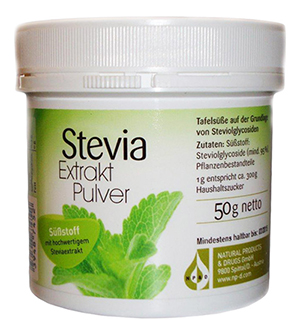
All manner of health-related services and products use green as their primary colour. Hospitals, chemists' and dentists' sometimes have a green logo, while organic food and nutritional supplements tend to have green in their packaging (Figure 4). The reason might be that green is considered to be a calming, reassuring colour.
Money
How many currencies around the world have a green bank note for their smallest denomination? The US famously does, and the UK used to. In many English-speaking communities, the word ‘green’ is slang for money. If you're thinking of setting up a low-end website for pay-day loans, perhaps green is the colour for you?
Jealousy
Although a bit shopworn, phrases in the English language like “I'm green with envy” and the “green-eyed monster” (possibly coined by Shakespeare) are well-established in art and literature.
Poison, radiation and corrosion
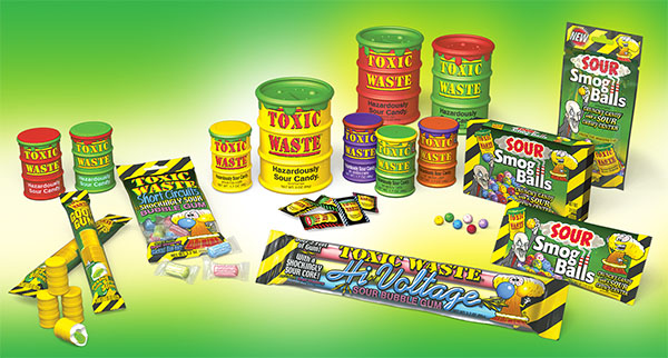
In popular culture, green has long been associated with poison. The spent nuclear fuel rods in the opening sequence of The Simpsons and the slimy spirits of Ghostbusters are just a couple of the icky, squelchy and runny substances in cartoonland that might be bad for you. Some of these things have even made the leap into real life (Figure 5).
Inexperience
In English, if someone is green, they are young, inexperienced and naïve. Maybe it's from the colour of a new soldier's uniform or the colour of an inexperienced sailor's skin on his first day out on the boat. Answers on a postcard, please.
Ireland
Ireland is strongly related with the colour green; just look what happens around the world on St. Patrick's day. The term ‘Kelly green’ (Kelly being a common Irish surname) probably comes from this association.
Paradise
Green is a traditional colour in Islam. In the Qur’an, it is referred to when describing paradise. The colour appears on the flags of a number of countries whose chief religion is Islam (Figure 6).
Update 18/07/16: For more on colour associations, Duke at First Site Guide shared this great article and infographic on the psychology of colour.
Colour theory and the colour green
If you're having trouble choosing colours for your project's palette, a good place to start might be the colour wheel. Colour theory, which aims to give insights into how colours interact, is only a starting point; I would always feel free to play around with colours and vary them according to the needs of the project.
Monochromatic
A monochromatic palette uses tints and shades of the same hue of green. It is an obvious choice for any environmentally-themed website, but it can be a bit tame.
Analogous
For me, green, yellow-green and sea green evoke rolling fields under a clear blue sky. This is a great choice for websites related with rural life or open-air events.
Complementary
Is it just me, or do green and red scream ‘Christmas’? A mostly green website with the occasional red accent can be really appealing, but too much red and it runs the risk of becoming lurid. Some people might see unexpected black or white outlines when green and red are placed next to each other, which can happen when complementary colours meet.
Triadic
Green, orange and purple can be a fun combination. Remember that you can tinker with tints and shades to get a palette that doesn't clash too much.
Split complementary
You'd think these four colours — green, yellow-green, red and purple-pink — would only be good for heralding the arrival of Jimbo's Flying Circus, but in fact they can work quite nicely, especially if one colour dominates and the others are used in moderation.
All the above colour swatches have the same base colour green (#0DBF0D), and I used Paletton to derive the secondary colours. Interestingly, even though it's exactly the same green in each swatch, sometimes it looks duller or more vibrant depending on the colours around it (e.g. when you compare the triadic and split complementary colour schemes).
The following is a showcase of some websites which (a) I like and (b) have a colour palette featuring green. Each one has things that I can learn and apply to my own websites in the future.
Treehouse
The folks at Treehouse went for a simple pastel colour scheme. Green echoes the ‘tree’ part of the name, while playful graphics in a range of other colours hint at the simplicity of the service Treehouse provides. Different pages use varying amounts of the primary green colour. The landing page is very green. For me, this is like saying “hello, we're Treehouse”. On the other hand, the ‘Features’ page is more white and grey. This implies to me that the ‘Features’ page probably has more nitty-gritty explanations in it. So, the first learning point is use lots of colour to attract attention, but when you have people's attention, tone the colours down. The site offers two packages, a Basic Plan and a Pro Plan. The details about the basic plan are in the standard green, but the Pro Plan uses a blue accent (Figure 7). There's the second learning point: use your dominant colour for your basic service, and your accent colour to highlight a more exclusive or luxury offering.

| Sample | My Name | Hex Code |
| Green | #5FCF80 | |
| Pastel Green | #B8F5D2 | |
| Blue | #42B4D6 | |
| Pink | #FBAEA8 | |
| Light Blue | #C1E0F5 | |
| Grey | #DCE1E5 |
Responsive Field Day
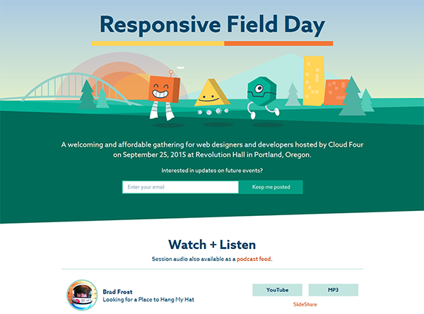
The Responsive Field Day web design conference held in Portland, Oregon in September 2015 looks like it had a great line-up of speakers, and most of the presentations are available to download as videos or podcasts. The recordings (I didn't attend the conference) are thought-provoking and entertaining — definitely worth a listen while you're doing your ironing or whatever. It's a simple one-page site, with fun graphics, minimal animations and a playful colour scheme (Figure 8). The dominant colour is pine green (I'm guessing that's Portland in the background), while orange, yellow and a couple of blues serve as accents. They not only colour the cute little roboty thingies in the site header, but also the UI elements, including buttons, headings and links. There's my learning point from this site: maintain colour consistency between images and UI elements. This is a great little site, with a beautiful, coherent colour palette.
| Sample | My Name | Hex Code |
| Dark Green | #016B59 | |
| Green | #01B295 | |
| Light Green | #C3E5DF | |
| Yellow | #FFD457 | |
| Orange | #F37737 | |
| Blue | #00476A |
The Crop Trust Annual Report 2014
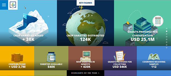
I like the fact that the Crop Trust avoided doing the obvious thing of using green for the primary colour in its annual report, and went with blue instead. Green still features, but more in its photography and as an accent colour. My next learning point, then, is don't always go for the obvious colour choice. The cover page presents attractive infographics (see Figure 9), while elsewhere, coloured triangles sprout, live and then wither, just like the crops that the organisation aims to protect. The navigation is not typical, but then this is not a typical site. All in all, I think it's a well-executed and original bit of design, and a good example of maintaining coherence in a colour scheme while avoiding triteness.
| Sample | My Name | Hex Code |
| Blue | #0775B4 | |
| Dark Blue | #0A2B50 | |
| Earth Green | #41571E | |
| Investment Green | #5AC6A6 | |
| Seed Green | #999C4E | |
| Gold | #F6B400 | |
| Red Brick | #8F5845 | |
| Violet | #4C4580 | |
| Another Blue | #4487D4 |
Owltastic
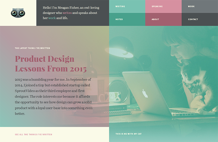
Even though Owltastic, the personal and professional blog of designer Meagan Fisher, doesn't get updated too often any more, it's still a lovely-looking site (Figure 10). Sea green, wine and cornfield yellow play together in text, backgrounds, photo overlays and UI elements. In fact, most of the buttons on her site have a green-yellow-red gradient as a background (Figure 11). What sounds like a terrible idea on paper actually works rather well. There's my lesson from Owltastic: select colours according to how they look (and perform), not how they sound.

| Sample | My Name | Hex Code |
| Charcoal | #4B5052 | |
| Sea Green | #48A18C | |
| Wine | #A2606F | |
| Cornfield Yellow | #FFE59C |
Beer 34
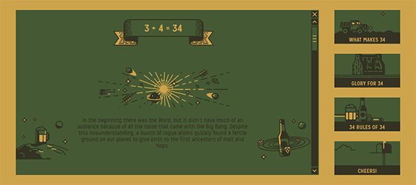
Georgian brewery Beer 34 didn't build a website; they built a shrine. I'm sure their product is great, but their site raises it to mythic proportions through beer-related stories and trivia, chunky graphics and understated animations. The minimal green and gold palette evokes fields of malt and hops, which is central to the 34 story (Figure 12). What can I take from this site? You can be creative no matter how limited your colour palette. An original navigation system using tiles rather than text links rounds out this charming site.
| Sample | My Name | Hex Code |
| Green | #455A34 | |
| Yellow | #CDA34C | |
| Grey | #343223 |
Conclusion
It's one thing to know your chartreuse from your verdigris, your analogous colours from your complements, and the many connotations that a choice of colours brings to the table. But it's quite another to select a palette that works for your project. I've really enjoyed this tour of green in the world of web design. So, what's your favourite hue and tint/shade of green? Do you have any green websites that you'd like to share? And how do you go about selecting a colour palette for your project?

Comments
comments powered by Disqus