Sticky menus
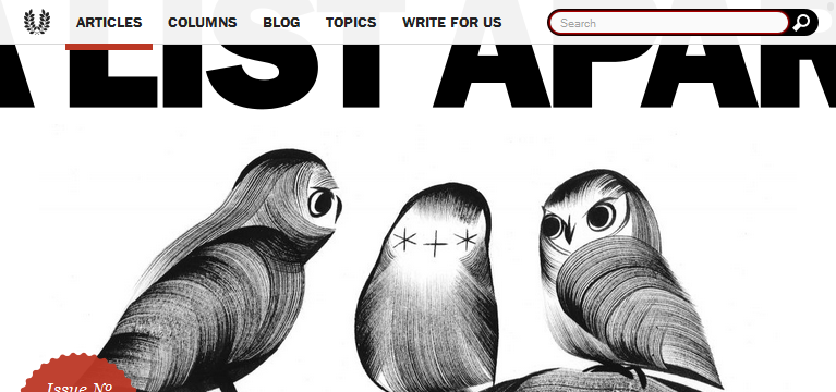
No, I᾿m not planning on talking about the printed material in a well-known chain of British pub/restaurants. Rather, I want to do a quick post on A List Apart᾿s main menu, and how they get it to do it’s thing. There are lots of juicy HTML and CSS morsels to get from just looking at the main navigation menu, among them how to make a menu stick to the top of a page, make a menu semi-transparent and replace a ‘home’ link with an image.

HTML
First surprising observation: the HTML for the main menu appears right at the end of the document, between the end of the footer and the end-of-body script tags. That must mean that there is some CSS jiggery-pokery that sends it to the top of the viewport.
For the privileged sighted user, this will be no problem, but how accessible is it? Do readers who are using a screenreader hit things in the same order as sighted readers? Is it weird to come across the main menu towards the end of the article, or is it better? I just tried reading an ALA article using a free screenreader (www.webbie.org.uk), and I didn᾿t find it at all easy to navigate to the main menu. I᾿m sure ALA knows what it’s doing, so I᾿ll reserve judgment until I find out more about making websites accessible.
Anyhoo, here᾿s the HTML for the main menu:
<!-- HTML -->
<nav class="global-nav" id="main-nav" role="navigation">
  <ul class="inline-items">
    <li><a href="/">Home</a></li>
    <li class="active"><a href="/articles">Articles</a></li>
    <!-- And so on. One <li> for each menu item,
       including the search input -->
  </ul>
</nav>
In short, the main menu consists of links to important pages, each inside a li element, each in turn appearing in an unordered list, which sits inside a nav. There are a couple of interesting points that this throws up.
It᾿s all relative: hrefs
One thing I᾿ve just picked up on is that the href attribute of the ‘Home’ link is "/". But where does this lead? To the site᾿s default page, of course. Here᾿s an article with more information about interesting things to put in href tags: href (HTML attribute).
The role of role
This article on www.w3.org details the function of the role attribute: Accessible Rich Internet Applications (WAI-ARIA) 1.0. In short, role tells screenreaders what the purpose of a particular element is, which makes a site more accessible. There is a list of roles that are recognised in HTML5; web designers shouldn᾿t just make up new roles.
CSS
The CSS for the main menu is fairly straightforward, but there are a few interesting nuggets to pick up. Here it is:
/* CSS for nav positioning */
.global-nav {
  position: absolute;
  z-index: 100;
  top: 0;
  width: 100%;
  height: 41px;
}Positions, please
position: absolute takes the target out of the flow of the document. The elements above and below the target shuffle next to each other, as if the target weren᾿t there, and you need to use top, bottom, left and/or right to move the target around. In ALA, the menu appears right at the top of the browser, because of top: 0. width: 100% and height: 41px set the x and y dimensions of the menu.
Transparency
There are two more lines which control the background colour of the main menu:
/* CSS for transparency */
.global-nav {
  background: #fff;
  background: rgba(255,255,255,.95);
}
The first sets it to white. The second sets it to white with 95% alpha. The first line, I᾿m guessing, acts as a fallback in case a reader᾿s browser doesn᾿t support RGBA. Very clever. So something else to take away is that, in the spirit of backwards compatibility/progressive enhancement, fallback rules in CSS should appear above more ‘advanced’ rules.
Skip to navigationImages as links
In the HTML, the ‘Home’ link appears as text—as it should for screenreaders, etc. In the browser, however, it appears as the site᾿s logo (a laurel wreath) and remains clickable, like a normal link. So, here᾿s the CSS for this:
/* CSS for home link */
.global-nav li:first-child a {
  display: inline-block;
  width: 24px;
  line-height: 40px;
  overflow: hidden;
  vertical-align: top;
  text-indent: 100%;
  background: url(icon_navigation-laurel.svg) no-repeat center;
}
Obviously, the background is an important instruction, and I guess the width and line-height are, too.
display: inline-block ensures that the element remains on the same line as the other links, but obeys vertical sizing instructions.
text-indent: 100% makes the ‘Home’ text scooch to the right, out of the way of the image (this is a bit of a hack), while overflow: hidden hides the text. I᾿m not sure what vertical-align: top does.
Conclusion
Getting the menu right is such an important part of making a satisfying website experience for users. To me, It᾿s worth spending a bit of time deciding what it should look like and how it should behave. Some things I᾿ve learned over the course of this post:
- I need to learn more about the details of accessibility. For example, is it OK to bury your main menu markup at the end of your document?
- I᾿m not using relative
hrefs to their full potential. roleneeds more investigation—what is it? What is it used for? What are the permitted values for this attribute?- I was a little bit intimidated by
position, but maybe I need to give it another look, especiallyabsolute. - Progressive enhancement requires fallbacks for when the main rule isn᾿t recognised.
- With a few hacks, images can be used to replace links.
That᾿s it for now. Hopefully, I᾿ll get another post in before Christmas, in which I᾿d like to look either at the hamburger menu on ALA or the search bar.
Skip to navigation
Comments
comments powered by Disqus