The carousel of praise

,
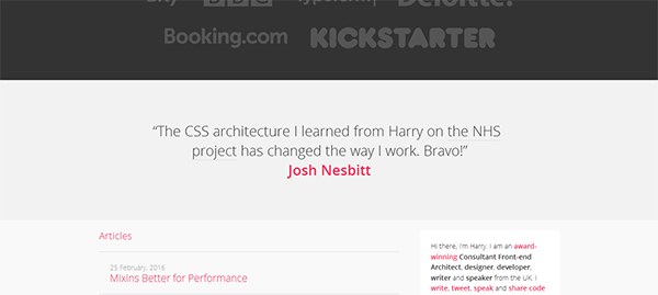
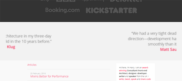
The ‘carousel of praise’ (Figure 1) is a feature that appears on countless business and freelancer sites, including CSS Wizardry. It's a great way to show off the positive feedback that you've received without taking up too much space on the screen. It is also fairly easy to implement using a little HTML and quite a lot of CSS, and in this post I'm interested in how it's done. Let's code like it's 2010!
A simple approach
The way the carousel is implemented is pretty simple (Figure 2). A row of five ‘panes’ is set up, each pane having the same width as the viewport. The container of these panes is animated, shifting from left to right and back, and stopping for a fixed interval so that the user can read what's on each pane. I think of it like a slide under a microscope.
Basic HTML structure
We start with a div and give it a class of .carousel. Inside, we have a ul with a class of .carousel__panes (note BEM naming approach). Inside this is a number of li elements, each with a class of .carousel__pane. Here's what we have so far:
<div class="carousel">
  <ul class="carousel__panes">
    <li class="carousel__pane"><!-- content goes here --></li>
    <li class="carousel__pane"><!-- content goes here --></li>
    <li class="carousel__pane"><!-- content goes here --></li>
  </ul>
</div>
In the case of CSS Wizardry, each of the li elements contains a blockquote, so let's stick with that, but in theory, we could put anything in them:
<li class="carousel__pane">
  <blockquote  class="pull-quote  pull-quote--banner">
    <p>Harry really helped us on <a href="/case-studies/xyz-site/"
    class="carousel__link">our project</a>. Thanks a lot!</p>
    <b class="pull-quote__source"><a href="www.example.com">
    Some Guy</a></b>
  </blockquote>
</li>General styles
First we give the .carousel element some general styles. overflow: hidden ensures that only the current carousel pane is visible. width:100% forces the carousel to fill the width of its container. text-align:center keeps the content in the centre of the element.
.carousel {
  overflow:hidden;
  width:100%;
  text-align:center
}
Some basic styles are added to the ul (.carousel__panes). We use width: 500% because there are five elements in our carousel.
.carousel__panes {
  margin:0;
  padding:0;
  list-style:none;
  position:relative;
  display:table;
  width:500%;
  overflow:hidden;
}
Again, it's important that the width of each li be a fraction of the containing element. Here, because there are five quotations, we want width:20%.
.carousel__pane {
  position:relative;
  display:table-cell;
  vertical-align:middle;
  width:20%
}
Timing is everything
The next step is to set up the @keyframes animation. To help us remember what it's for, let's give it a recognisable name, carousel:
@keyframes carousel {
  /* animation rules go here */
}
There are five elements in our carousel, so we should animate each at 20% increments, right?
@keyframes carousel {
  0%   {}
  20%  {}
  40%  {}
  60%  {}
  80%  {}
  100% {}
}
Well, no. We also need to consider the second or so that it takes for the current pane to shift from view and the new pane to appear. On CSS Wizardry, the carousel takes 45 seconds to complete one cycle, from left to right. The transition between the current pane and the next one takes just over a second (1.40625 seconds to be precise). What's this in percentage terms?
1.40625 seconds ÷ 45 seconds × 100 = 3.125%
Now, we need to work out how long a pane stays on screen as a percentage. There are four interstitial steps sandwiched between the five main steps, so let's subtract those.
100% - (4 interstitial steps × 3.125%) = 87.5%
Now divide this by the number of panes:
87.5% ÷ 5 panes = 17.5%
So, each pane stays on screen for 17.5% of the animation duration, or:
17.5% × 45 seconds ÷ 100 = 7.875 seconds
Hopefully, as long as there isn't too much content in each pane, most readers should be able to scan it within 7.875 seconds.
So, the first step in our @keyframes starts at 0% and ends at 17.5%. Then, there's an interstitial step of 3.125%, which takes us to 20.625%. The second step lasts another 17.5%, which takes us to 38.125%. This is followed by another interstitial step of 3.125% (41.25%), and so on until we reach 100%. The main part of the @keyframes rules should look like this:
@keyframes carousel {
  0%, 17.5%        {}
  20.625%, 38.125% {}
  41.25%, 58.75%   {}
  61.875%, 79.375% {}
  82.5%, 100%      {}
}
The next step is to decide what styles to apply to each animation rule.
Shift and blur
The horizontal shift is achieved using transform: translate3d along the x-axis:
@keyframes carousel {
  0%, 17.5%        { transform: translate3d(0, 0, 0) }
  20.625%, 38.125% { transform: translate3d(-20%, 0, 0) }
  41.25%, 58.75%   { transform: translate3d(-40%, 0, 0) }
  61.875%, 79.375% { transform: translate3d(-60%, 0, 0) }
  82.5%, 100%      { transform: translate3d(-80%, 0, 0) }
}
One further je ne sais quoi that CSS Wizardry adds is a slight blur effect, which adds to the impression of speed (Figure 3). While a pane is on-screen, the blur is set to 0, but while it is moving the blur is added. In order not to be too jarring, the blur increases gradually, reaches a peak at the mid-point of the interstitial stage (3.125% ÷ 2 = 1.5625%) and then returns to 0 as the new pane comes into view.
Here's how @keyframes should look now:
@keyframes carousel {
  /* Shift and non-blurred states */
  0%,
  17.5% {
    transform: translate3d(0, 0, 0);
    filter: blur(0);
  }
  20.625%,
  38.125% {
    transform: translate3d(-20%, 0, 0);
    filter: blur(0);
  }
  41.25%,
  58.75% {
    transform: translate3d(-40%, 0, 0);
    filter: blur(0);
  }
  61.875%,
  79.375% {
    transform: translate3d(-60%, 0, 0);
    filter: blur(0);
  }
  82.5%,
  100% {
    transform: translate3d(-80%, 0, 0);
    filter: blur(0);
  }

  /* Blurred states at the mid-point of each interstitial stage */
  19.0625%,   /* = 17.5% + 1.5625% */
  39.6875%,   /* = 38.125% + 1.5625% */
  60.3125%,   /* = 58.75% + 1.5625% */
  80.9375% {  /* = 79.375% + 1.5625% */
    filter:blur(2px)
  }
} /* End of @keyframes */
Finally, we add filter: blur(0) to .carousel__panes as a default value.
Finishing touches
Only a couple more steps remain. We need to link the animation to the .carousel__panes element:
.carousel__panes {
  /* General styles */
  animation: carousel 45s alternate infinite;
}
What do these mean?
carouselis the name we gave to the animation earlier.45sis the duration of the animation in seconds.alternatemeans that the animation with play through once, then play through again but in reverse.infiniteforces the animation to play on an infinite loop.
As a bonus feature for desktop users, we want the animation to pause on hover:
.carousel__panes:hover {
  animation-play-state: paused;
}
The last step is to copy-and-paste all rules that require -webkit- and -moz- browser prefixes. These include @keyframes, filter, transform, animation and animation-play-state properties.
Conclusion
With a little secondary-school arithmetic, it's possible to add an infinitely revolving carousel to a site. The use to which it has been put on CSS Wizardry is perfect: adding a little pizazz to a non-essential feature that doesn't require any user interaction.
From personal experience, this kind of carousel can get annoying if it contains elements that a user needs to interact with. For example, it wouldn't be a good idea to use it for long-form content or navigation. If the user sees something she's interested in, but doesn't finish reading or doesn't click a link in time, she'll have to wait for up to 45 seconds for the pane to reappear. More importantly, there's no signal which informs her how long it will take for the pane to come back. There are other carousel implementations that give users control over which element is on screen, but in my opinion, even these should be used with care.
Comments
comments powered by Disqus